APRF (Aggregate Performance Reporting) is a new IETF deliverability-feedback proposal. Here's what APRF is, how the DKIM-based TXT record and JSON reports work, how SDI segmentation works, how to analyze inbox/unwanted/positive/negative metrics, why the industry needs it now that Gmail Postmaster Tools dropped reputation, and how Postmaster+ generates your record and aggregates the data.
If you manage email deliverability, there’s a new acronym you’ll want on your radar: APRF. Short for Aggregate Performance Reporting, it’s a new IETF proposal that gives senders something we’ve wanted for years: aggregated, provider-reported feedback on how our mail actually performs once it reaches the inbox (or doesn’t). Think of it as the deliverability-feedback cousin of DMARC.
It’s still early days, but the standard is real, reports are flowing, and Postmaster+ already supports it. Below we’ll cover what APRF is, how it works, how to read the reports, and how to start collecting your own data today.
What is APRF (Aggregate Performance Reporting)?
APRF is a proposed email specification, currently moving through the IETF, that lets mailbox providers send senders aggregated feedback about their mail performance. Instead of guessing where your messages land based on open rates and seed tests, APRF gives you provider-sourced counts of how much of your mail hit the inbox, how much was filtered as unwanted, and how recipients engaged with it.
Big shout-out to the people who brought APRF to life: Alex Brotman (Comcast), Tom Corbett (Hightouch), and Emil Gustafsson (formerly Google). Their proposal, draft-brotman-aggregate-performance-reporting, is published at the IETF, and the fact that it has backing from across the mailbox-provider and ESP worlds tells you this isn’t a fringe idea. For a great outside take, deliverability veteran Al Iverson wrote it up over on Spam Resource.
How APRF works
If you’ve ever set up DMARC reporting, APRF will feel familiar. It’s DKIM-based, and you opt in by publishing a DNS TXT record that tells participating providers where to send your reports.
The record lives under your DKIM namespace, and you have a few ways to place it:
_aprf._domainkey.[yourdomain.com]is a domain-wide default that covers every DKIM selector at once. It’s the simplest option, and a good pick if you’d rather not deal with wildcards.*._aprf._domainkey.[yourdomain.com]is the wildcard form of that same domain-wide default. It does the same job as the bare record above, so use whichever your DNS provider handles more comfortably.[selector]._aprf._domainkey.[yourdomain.com]targets one specific DKIM selector. A selector-level record overrides the domain-wide default for that selector, so you can route its reports to a different destination.
In each case the value follows a simple, DMARC-like syntax that names a reporting address:
v=APRFv1; rua=mailto:aprf-reports@yourdomain.com;
Once that record is live, participating providers deliver periodic reports to the address you specified, formatted as structured JSON.
Segmenting your data with SDI
APRF also supports an optional SDI (Signer-Defined Identifiers) tag, and this is where it gets powerful. If you’ve ever used Gmail’s feedback-id header, the idea will click right away: you add a custom header to your outbound mail, then name that header (and a separator character) in your APRF record, and the provider breaks your numbers out along it. You get up to four levels of granularity, so a single message could carry a sender name, a sub-account, and a campaign ID, and your reports would split performance across all three.
In practice, that means adding an sdi tag to your record:
v=APRFv1; rua=mailto:aprf-reports@yourdomain.com; sdi=X-Campaign-Info,^
The difference is going from “our Comcast placement dipped this week” to “our Comcast placement dipped on one campaign, from one sub-account.” That’s the level of detail that actually lets you fix something.
APRF vs. DMARC: what’s the difference?
APRF borrows DMARC’s delivery mechanism (publish a DNS TXT record, receive aggregated reports), but the two answer completely different questions. DMARC is about authentication: is this mail really from who it claims to be, and what should happen if it fails? APRF is about performance: of the mail that got through, how much reached the inbox, how much was treated as unwanted, and how did people react? They’re complementary. DMARC protects your domain; APRF tells you how your legitimate mail is doing.
What’s in an APRF report?
Each APRF report covers a single domain over a time window (Comcast currently sends daily reports) and breaks down into two categories of metrics: classification (where mail landed) and engagement (what recipients did with it).
Before we get to the metrics, an important point: APRF does not lock providers into a fixed report. The IETF draft defines classification categories like inbox, unwanted, forwarded, and promotional, plus engagement categories of positive, negative, and neutral, but it deliberately leaves the exact contents up to each provider. Both the classification and engagement sections are optional, and as the spec itself puts it, “there is no formal definition of these metrics… Each MBP/report generator may have different actions that belong in each of these categories.”
So the metrics below are the ones Comcast/Xfinity sends today. As Comcast iterates and other mailbox providers begin reporting, expect the exact fields, and how each provider defines them, to differ. Here are the four you’ll spend the most time with right now:
| Metric | Category | What it means |
|---|---|---|
| inbox | Classification | Messages delivered to the inbox |
| unwanted | Classification | Messages delivered to the spam / junk folder |
| positive | Engagement | Messages a user marked as not spam (rescued from the spam folder) |
| negative | Engagement | Messages a user marked as spam (complaints) |
Put simply: inbox and unwanted tell you where the provider filtered your mail, while positive and negative tell you how recipients pushed back, either rescuing you from the spam folder or reporting you into it.
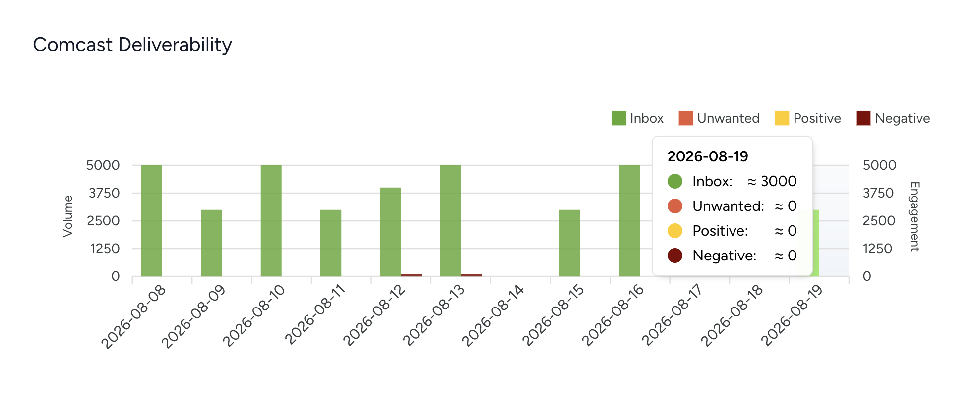
How to read and analyze your APRF data
Here’s an illustrative example of a single day’s report for a domain sending a healthy volume to Comcast:
| Metric | Value (approx.) |
|---|---|
| inbox | 240,000 |
| unwanted | 30,000 |
| positive | 100 |
| negative | 200 |
At a glance, the vast majority of this sender’s mail is reaching the inbox, but roughly one in nine messages is being filtered as unwanted, a number to keep an eye on. On the engagement side, more users marked messages as spam (negative) than rescued them (positive), a nudge to review content, list hygiene, and sending cadence for this audience.
The value shows up over time. A single day is a snapshot; the trend is the story. Watch for the unwanted count climbing relative to inbox, or negative engagement creeping up after a content or frequency change. Those are early warnings you can act on before they drag down your broader reputation.
Who supports APRF today?
As of now, Comcast/Xfinity is the first and only mailbox provider actively sending APRF reports, and it’s doing so in beta. That already makes APRF useful if Comcast is a meaningful slice of your list, and for many B2C senders, it is. Getting set up now also means you’ll be collecting data from day one as more providers come online.
Why we need APRF (and why more providers should send it)
Here’s the backdrop that makes APRF matter: the signals senders have leaned on for years are drying up, fast. Google just retired the classic (v1) Postmaster Tools interface, and its v2 replacement dropped domain and IP reputation. Apple’s Mail Privacy Protection pre-loads images and turns open rates into noise, and its Link Tracking Protection strips parameters off URLs. Privacy regulators in Europe (France’s CNIL and Italy’s Garante among them) have tightened the rules around tracking pixels without explicit consent. On top of all that, AI is changing the inbox itself: summaries, smart triage, and agents increasingly read and sort mail on the recipient’s behalf, which scrambles what an “open” or a “click” even means.
The old mix of open rates, click data, and provider reputation scores isn’t gone entirely, but it’s a much shakier foundation than it was even a year ago. That gap is exactly what APRF fills. Instead of inferring placement from proxy metrics, or a reputation score that no longer exists, senders get it reported straight from the source, the mailbox provider itself, without tracking individual recipients. It’s privacy-respecting feedback that still tells you what you need to know.
A feedback standard is only as useful as the number of providers sending data, though. Right now that’s Comcast, and credit goes to Alex Brotman and the team there for leading the way and shipping reports while the spec is still young. Our hope is that Gmail, Yahoo, and Outlook follow. If you work at a mailbox provider, adding APRF support is one of the highest-impact things you can do for sender-side deliverability right now, and we’d love to see you send data too.
APRF support in Postmaster+
We were excited about APRF, so we built support for it into Postmaster+ right away. If you’ve ever used a DMARC reporting service, the model will feel instantly familiar, because we handle APRF the same way.
Here’s how it works:
1. We generate your TXT record
Point Postmaster+ at a domain and we generate the exact APRF TXT record for you to publish, pre-filled with a dedicated OptiPub reporting address so the reports come straight to us. It looks like this:
*._aprf._domainkey.yourdomain.com TXT "v=APRFv1; rua=mailto:[your-unique-seed-address]"
We provide both a wildcard record (covers all selectors) and per-selector records, and we continuously validate that the record is published correctly so you know reporting is live.
2. We receive and aggregate your reports
Once the record is live, Comcast sends its APRF reports to that address, and Postmaster+ ingests, parses, and aggregates every one, exactly like a DMARC provider does with rua reports. No inbox to babysit, no JSON to hand-parse. Just clean, aggregated deliverability data.
3. You access the data however you work
Your Comcast deliverability data shows up right in the Postmaster+ app, ready to read and trend over time. Prefer to work programmatically? Pull your APRF reports through our API. Running an AI workflow? Connect the Postmaster+ MCP and ask your agent things like “How did my Comcast inbox placement trend this week?”, backed by live report data.
Get started with APRF
APRF is one of the most promising things to happen to deliverability feedback in a long time, and the best time to start collecting your own reports is now, while it’s early and every data point is a head start. Add your domain to Postmaster+, publish the TXT record we generate for you, and you’ll start seeing Comcast APRF data flow in.
Huge thanks to Alex, Tom, and Emil for pushing this standard forward. We’re rooting for full adoption, and we’ll keep building support as more providers join.
Get 1,000 Postmaster+ credits, on us
Redeem code APRF2026 and start collecting your Comcast APRF reports today. One credit per report, 1,000 free to spend across APRF and everything else in Postmaster+. First 100 senders only.